Retention.

End-to-end ownership · I led the retention lifecycle for Meta AI glasses — and shipped the 30-day recap that proved the system.

Why it matters
60+ days
the retention lifecycle I owned — from the purchase emails through the day-14 / 30 / 45 checkpoints.
AI-native
ran all design phases with AI in the loop — then AI-coded the front-end into production.
Revisit signal
users came back to the recap on their own — a pushed promo that turned into something they chose to reopen.
The operating model
Retention isn't a screen.
It's a lifecycle.

I mapped where users drift, then chose the right move at each point — what to surface, to whom, and when. I shipped a series of interventions across this journey; the day-30 recap below is the one I'll show in depth.

Pre-arrival
Excitement peaks before it ships — pre-teach features in the order emails.
Day 0
Unboxing — onboard around what they already showed interest in.
Day 14
Still deciding if it sticks — reinforce the one habit forming.
Day 30
Novelty fades — reflect on the month, then point to what's next.
Day 45
Drifting — a reason to return, matched to who they are.

Meanwhile experiments were fighting each other — everyone reached for the full-screen bottom sheet. So I defined the operating logic: match a user's maturity and a feature's value — scored by a Retention Rating — to the right component intensity, so the next nudge was always the next best thing untried.

New · ~day 14
Surfacecore habits — capture, listen, communicate
Intensityquiet — inline card
Goalform the first habit
Maturing · ~day 30
Surfacethe next valuable feature they haven't tried
Intensitya moment — the recap story
Goalbroaden usage
Drifting · ~day 45
Surfacepersona-matched reason to return
Intensitytargeted — contextual nudge
Goalwin back the drift
Design direction · some pieces shipped, others were still in build
A flagship example
The 30-day recap.

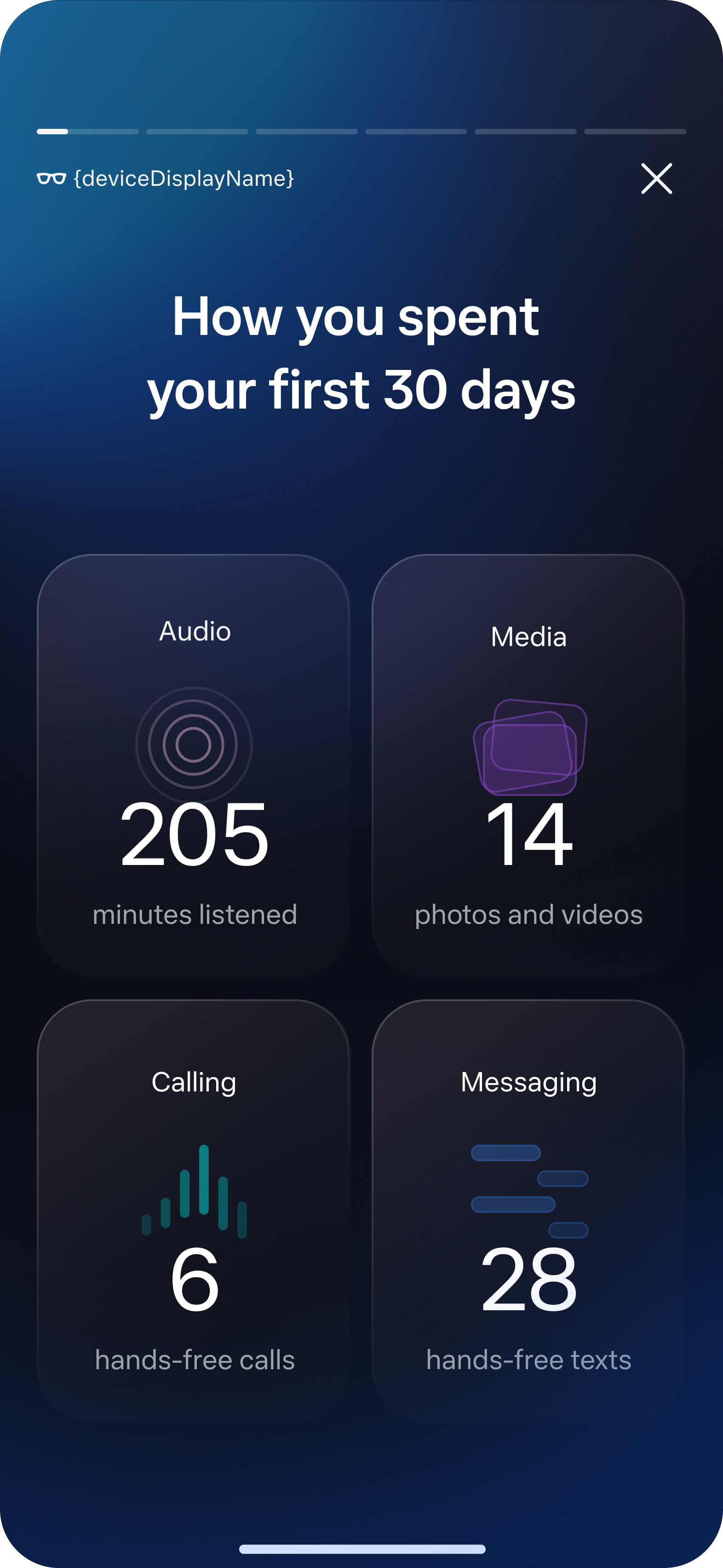
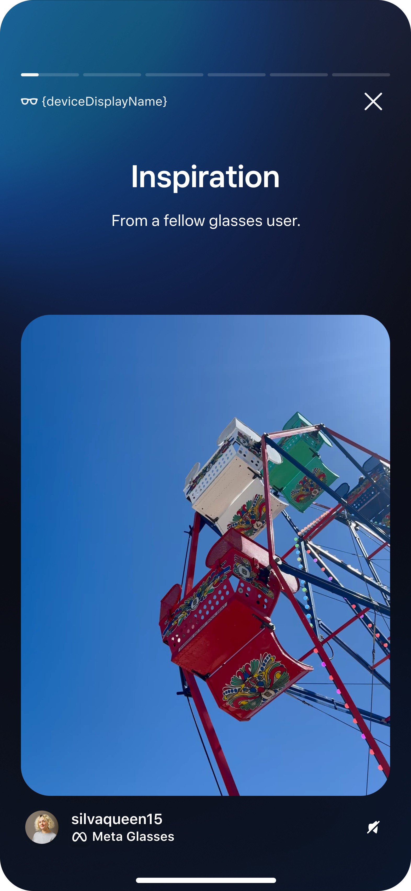
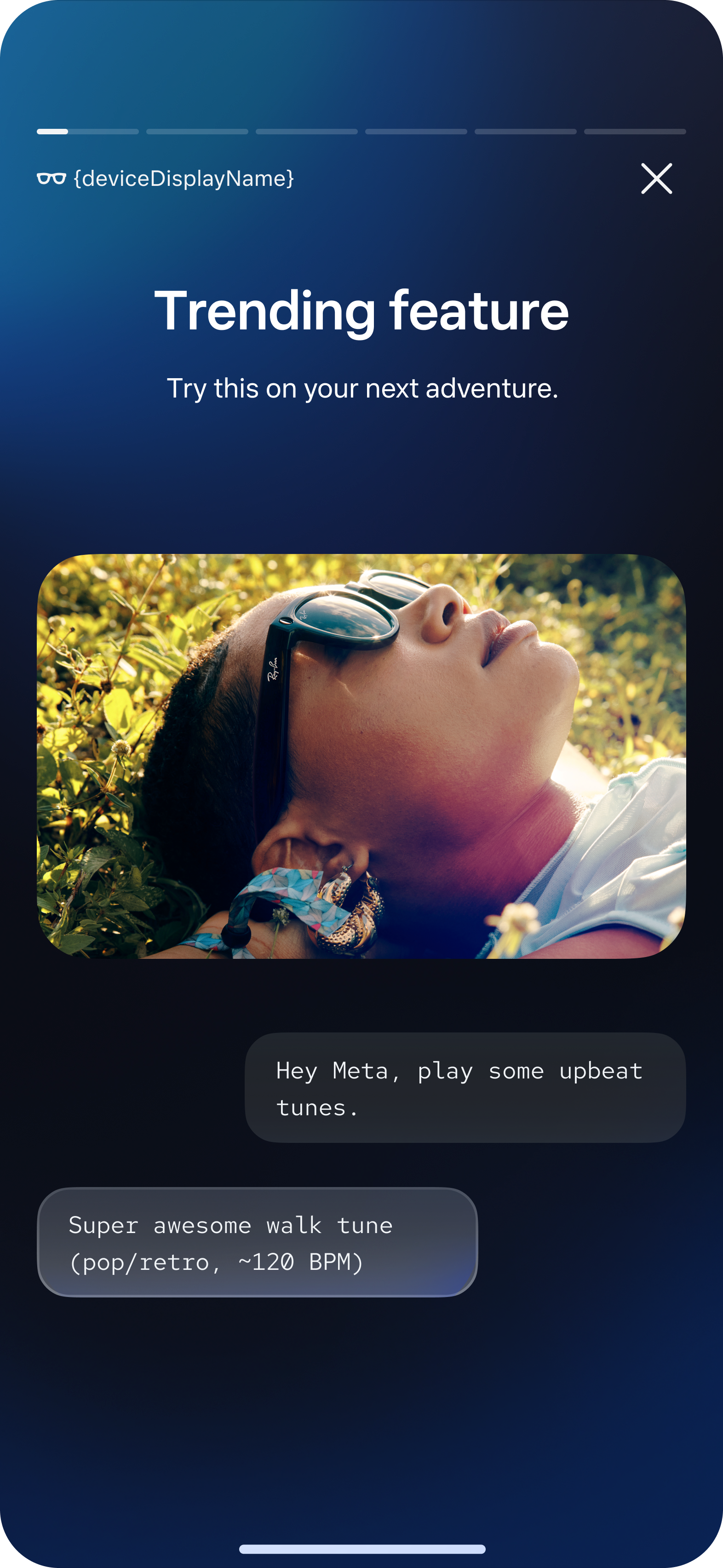
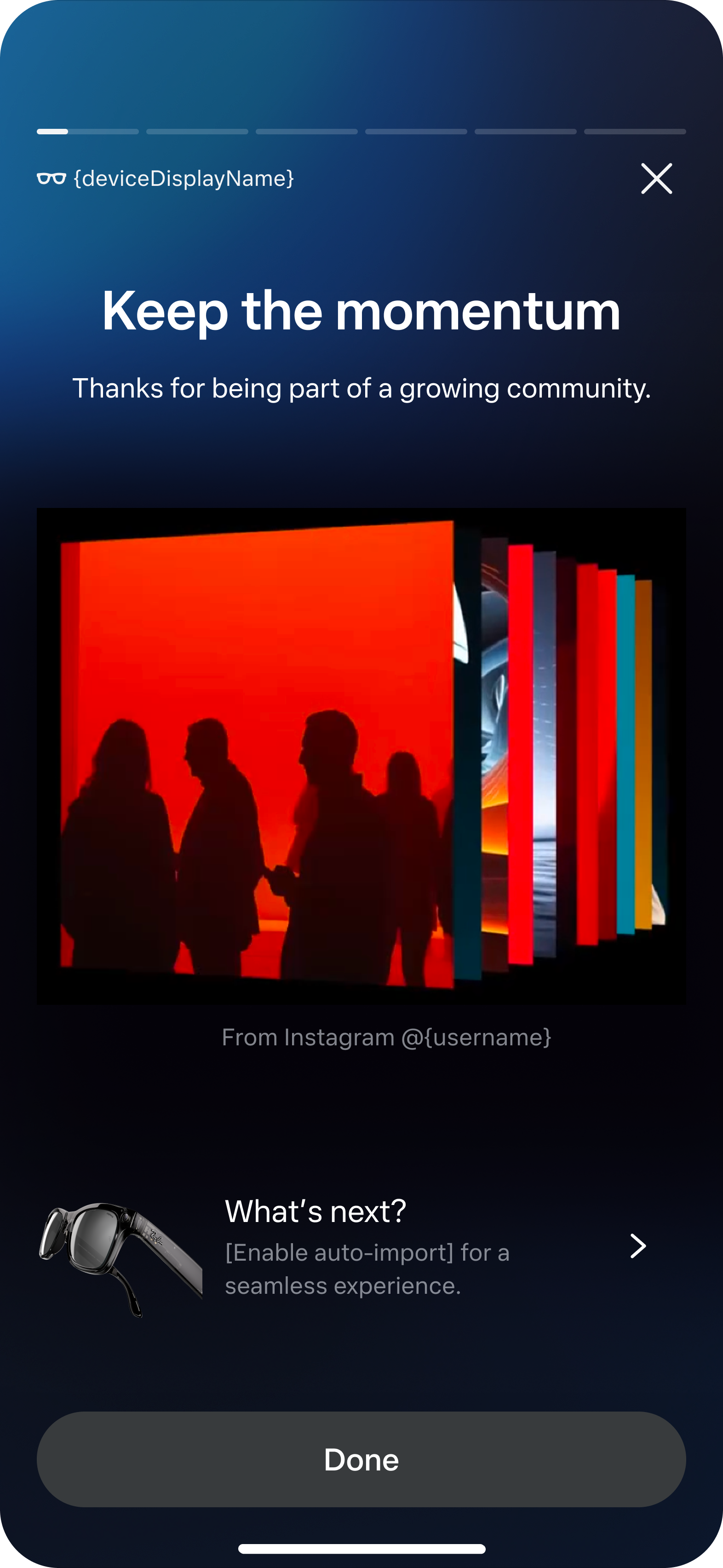
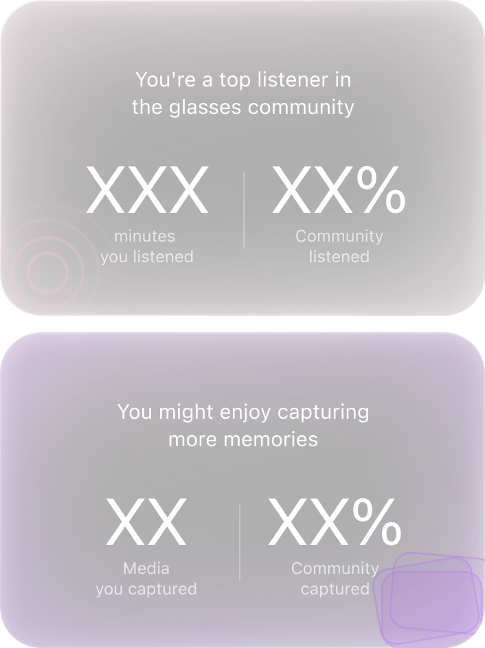
Of everything I shipped across the lifecycle, this is the one I'm proudest to show — a Wrapped-style story for your glasses. Five pages recap your month, then point you at what to try next.

01 · Opening
Revisit your first 30 days
Sets it up as a story to scroll, not a tool to use.
02 · Data recap
How you spent it
The four highest-retention features — listen, capture, call, message.
03 · Inspiration
From a fellow user
A real capture, surfaced to spark "I could do that too."
04 · Guidance
Try this next
A specific, low-friction feature to try — the retention nudge.
05 · Closing
Keep the momentum
Ends on community energy and a single next step.
Shipped product · personal data mocked for privacy.
Product judgment
Knowing what to leave out.

Not everything I designed made the final recap. Some calls were mine, some came from Legal and privacy review — but knowing what to leave out is the judgment, not the loss.

Community comparison page, designed then removed
Designed · removed
The community comparison
How your month stacked up against other glasses owners — meant to ease FOMO and pull people toward features they hadn't tried. Legal flagged the aggregate community data as competitively sensitive, so I removed it before launch.
Photo recap gallery, designed then removed
Designed · removed
The photo recap
A gallery replaying the moments you captured on your glasses. Given how personal that media is, privacy concerns made it the wrong call — so I held it back.
How it was built
AI-native, end to end.

I ran all four phases — concept, prototype, user testing, production — with AI in the loop. AI expanded directions and pre-tested the flow; I built the front-end in Claude Code and committed to the same codebase as engineering, then fixed UI directly in QA instead of filing tickets.

01
Design concept
Manus · Google Stitch
02
Iteration & prototyping
Claude Code · Google Stitch
03
Motion & visual design
Weavy AI
04
User testing & production
Claude Code · Meta AI coding

AI pushed execution toward zero. Judgment became the bottleneck — choosing the direction, holding the context, owning the quality.

Entry card in the app
Re-entry through history
The signal

They came back on their own.

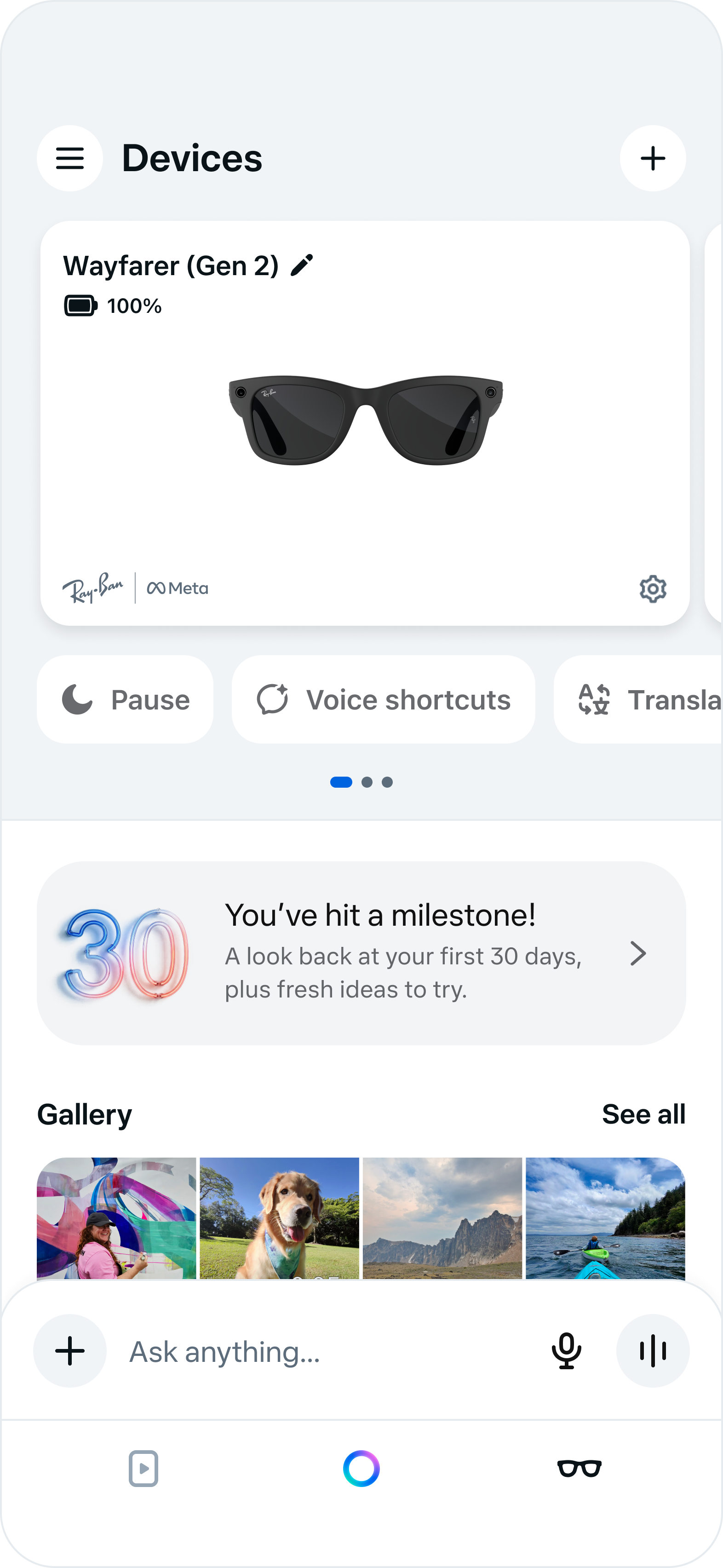
As an experiment, the entry showed once, then stepped aside for other experiments. Users still dug it out of their notification history — some, again and again.

A pushed promo had quietly become a personal artifact — something people chose to reopen. I read it as observed behavior, not proven motive, and used the signal to reshape the retention roadmap that followed.

The takeaway

The right moment, the right signal, and the right level of interruption can turn retention from a push into a pull.

Next: Robotics Research Back to all work